")
You load up a new game, the graphics look sharp, but then you notice something odd. Around the edges of the screen, the colors seem to split a little, red and blue outlines dancing where they should not be. It feels like your eyes are playing tricks on you, right? Not really. That’s chromatic aberration, and it’s there on purpose.
Game developers use this visual effect to make scenes feel more real. It copies how a camera lens bends light, giving the image a soft, cinematic feel. When used the right way, it adds atmosphere and depth. When pushed too far, it can make everything look blurry or messy.
Some players love it because it makes the game world look alive. Others hate it because it feels like a smudge on the screen. It divides opinion more than motion blur ever did.
In this guide, we’ll break down what chromatic aberration in games actually does, why developers add it, and how it affects the way you see a game. By the end, you’ll know when it helps your experience and when it is better left turned off.
Let’s start from the beginning and see what this strange little effect really is.
What Is Chromatic Aberration in Games?
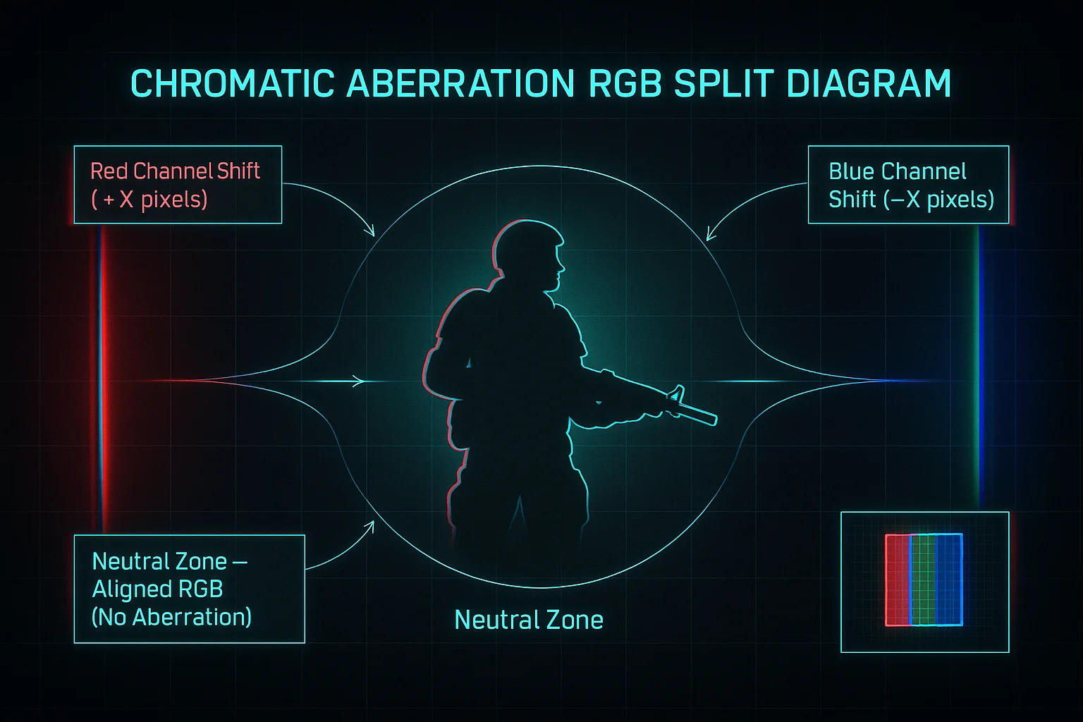
If you have ever taken a photo with your phone and noticed strange red or blue edges around objects, you have already seen chromatic aberration in action. In games, it is a post-processing effect that tries to copy how real camera lenses bend light.
When light passes through a camera lens, it splits into colors like red, green, and blue. Each color bends differently, which creates a small separation called RGB separation. Games use this effect to make the screen look more cinematic and lifelike. Developers call this technique an optical simulation, and it helps a digital scene feel less “perfect,” more like what a human eye might see through a camera.
In simple words, chromatic aberration adds tiny color distortions to make a virtual image feel real. It is not a bug or mistake; it is part of the game’s visual design.
You can imagine it like this:
- Without chromatic aberration, the picture looks sharp and clean.
- With it, the screen gets soft edges and subtle color fringing.
It can look beautiful in story-driven or cinematic games where mood matters more than precision. But in competitive or fast-action titles, it sometimes becomes a distraction.
If you want to understand how it connects to your computer’s graphics pipeline, check out How Post-Processing Affects Game Performance. It explains how visual effects like blur, bloom, and chromatic aberration all work together.
The Science Behind It
Now let’s look at the science that makes this effect work.
Light travels in waves, and each color of light has a different wavelength. When those waves hit a curved lens, they bend, a process called refraction. Because each color bends slightly differently, they do not meet at the exact same point. This tiny difference creates wavelength distortion, also known as color offset.
Game engines use shaders to copy this behavior. A shader effect shifts the red, green, and blue channels just a bit apart, especially around the corners of the screen. It tricks your brain into thinking you are seeing through glass or a real lens.
If you have ever wondered, “Why do colors blur on screen edges in games?”, this is your answer. It is a deliberate design, not a flaw. For a deeper look at how light behaves inside digital graphics, explore How Light Rendering Works in Modern Engines.
Why Developers Use Chromatic Aberration
To understand why so many developers use chromatic aberration, you need to think about what it adds to the screen. Modern games are not just about sharp graphics. They are about feeling, mood, and immersion. Chromatic aberration helps achieve that. It makes digital images look a little imperfect, a little more human.
In the real world, camera lenses never produce a perfectly clean image. There are soft edges, light leaks, and color shifts. Developers use chromatic aberration to simulate that same natural imperfection. This is called a lens simulation. It gives the player a stronger sense of presence inside the world. The slight blur tricks your brain into seeing depth that a flat screen cannot naturally show.
When used correctly, this effect adds cinematic realism and immersive visuals. Players feel like they are watching a movie instead of a computer-rendered scene. The small color split adds life and movement to the frame, creating an emotional layer that pure technical sharpness often removes.
Here are a few reasons why developers apply it in their rendering pipeline:
- It adds a filmic look that fits story-driven or emotional scenes.
- It hides minor imperfections in texture or lighting.
- It improves visual storytelling, especially when the camera moves fast.
- It blends other post-processing effects like bloom and vignette for richer contrast.
However, balance is key. Too much chromatic aberration can lead to aesthetic distortion, where details blur beyond what looks artistic. The goal is not to confuse the player but to create a mood. When handled with care, it guides the eye and enhances the atmosphere without stealing clarity.
For a deeper look at how this effect fits into a larger visual workflow, check out Best Post-Processing Effects for Realistic Games. It explains how different effects work together to shape the final look of modern titles.
Editor’s Recommendation: What Are Hall Effect Switches?
Examples from Popular Titles
Several well-known games use chromatic aberration to set tone and style. The results show how creative direction decides whether this effect feels natural or forced.
In Cyberpunk 2077, the developers used chromatic aberration to push a futuristic, dreamlike mood. The city lights scatter slightly, giving the impression that the player’s eyes are struggling to process neon overload. This effect blends with bloom and motion blur, creating a world that feels alive but slightly unstable.
In contrast, Resident Evil Village uses the effect in a more subtle way. The soft blur at the screen edges helps players focus on the eerie center of the scene, improving tension without hurting visibility. It supports the realism of the camera lens while keeping gameplay clear.
Other games like Dying Light 2 and Control also rely on the effect for mood building and visual feedback. Developers apply it through the rendering pipeline, mixing it with lighting and depth effects to add cinematic weight to the scene.
For detailed insight into how these artistic choices evolve during development, explore Case Study: Cyberpunk’s Visual Design Choices. It breaks down how post-processing effects like this shape the identity of a game.
When Chromatic Aberration Becomes a Problem
Chromatic aberration can look beautiful when used the right way, but sometimes it gets in the way of gameplay. The same soft blur that makes a cinematic cutscene feel emotional can turn a fast, competitive match into a frustrating mess. Many players instantly go into settings to disable chromatic aberration because it affects clarity and focus.
In competitive games, every frame and every detail counts. This effect slightly shifts the red, green, and blue channels, which reduces sharpness around edges. That split may look artistic, but to a player tracking enemies or reading small HUD details, it becomes visual noise.
Why It Becomes a Problem
- It softens the picture and makes fine details harder to see.
- It can cause eye strain because your eyes try to refocus constantly.
- It adds tiny color fringes that distract from targets or text.
- It can make aiming slower in FPS or racing games.
The blur also affects gaming performance indirectly. While it doesn’t reduce FPS much, it changes how clear the visuals appear during movement. Your brain works harder to process what’s happening, which can lead to fatigue in long play sessions.
Players who compete in esports often describe it as playing with slightly foggy glasses. It dulls the scene and removes the crisp edge clarity they rely on. That’s why most pro players prefer their visuals clean, bright, and sharp.
When combined with motion blur or depth of field, the problem gets worse. These layered effects make the scene feel heavy and out of focus. If your game relies on split-second decisions, this can lead to slower reactions and mistakes.
If your goal is pure focus, it’s better to turn this effect off. You’ll notice a sharper image and faster visual response. To learn more about balancing style with speed, see Optimize FPS Settings for Competitive Gaming. It breaks down how clarity boosts both comfort and reaction time.
So if you ever find yourself asking, “Should I turn off chromatic aberration in games?”, remember this simple rule:
- For cinematic single-player games, you can keep it on.
- For precision-based or competitive titles, turn it off for cleaner visuals.
Accessibility and Clarity
Accessibility is about more than just button remapping or subtitles. It also means giving players control over how visuals feel. Effects like chromatic aberration can make some people dizzy or uncomfortable. That’s why accessibility settings matter; they help players create a comfortable view that fits their needs.
When developers pile up multiple post-processing effects, like bloom, motion blur, and color distortion, the brain struggles to keep up. Constant visual refocusing can lead to motion sickness in games, especially for players who are sensitive to fast changes in brightness and color.
To prevent that, many studios now include:
- Toggling effects: On/off options for post-processing filters.
- Sharp HUD readability: Crisp text and icons that stay clear even with effects active.
- Comfort design: Layouts and lighting choices that reduce visual stress.
Games like Resident Evil 4 Remake and Cyberpunk 2077 later added these toggles after player feedback. That simple change made a huge difference in how accessible the games felt.
If you’re a developer or designer, adding such flexibility shows you value player comfort. You can read more about this in Accessibility Options Every Game Should Offer. It dives deeper into how comfort-focused visuals can improve the gaming experience for everyone.
How to Disable or Adjust It (Player Guide)
Sometimes all you want is a clean, sharp screen. No blur, no glow, just pure clarity. If that’s you, turning off chromatic aberration is easy once you know where to look. The option usually hides inside the graphics settings or the post-processing menu of your game. It might take a few clicks, but the change can make a big difference.
Most games let you disable chromatic aberration directly from their visual settings. You can find it listed along with effects like bloom, motion blur, or depth of field. When you toggle it off, the color fringing around objects disappears and edges become more defined. The overall image feels cleaner, especially in first-person or fast-action games.
Here’s a quick way to find and adjust it:
- Step 1: Open the game’s settings from the main menu.
- Step 2: Look for the Graphics or Display section.
- Step 3: Scroll to Advanced Settings or Post-Processing Options.
- Step 4: Find “Chromatic Aberration” or “Lens Distortion.”
- Step 5: Turn it off or adjust the slider to reduce the intensity.
Some modern engines, like Unreal and Unity, have built-in toggles at the engine level. Developers often use these for fine-tuning the effect instead of removing it completely. If you’re modding or tweaking configuration files, you can search for “r.LensChromaticAberration” or similar variables to disable it manually.
The difference is easy to spot. Disabling the effect gives you:
- Sharper textures and cleaner outlines.
- Better visibility in dark or detailed scenes.
- Slightly lower visual “pop,” but higher gameplay focus.
Turning it off can also help with performance optimization, especially on mid-range PCs or consoles. Every post-processing filter takes a bit of GPU power, so fewer effects mean smoother frames.
If you want a detailed guide for your specific setup, check out Step-by-Step Game Settings Guide for PC & Console. It explains how to adjust visual effects safely without breaking your graphics balance.
So next time you ask, “How to turn off chromatic aberration in any game?”The answer is simple: jump into your settings, find the right toggle, and enjoy the clean view.
Developer Insights: Using It Without Overdoing It

For developers, chromatic aberration is one of those effects that can make or break the look of a game. Used with care, it adds cinematic warmth and depth. Overused, it makes everything look smeared and low-quality. The key is to control it through careful shader optimization and game engine settings.
In modern rendering, chromatic aberration sits inside the post-processing stack. It works by slightly shifting the red, green, and blue color channels across the image. A well-written chromatic aberration shader runs this offset efficiently, applying it only near the screen edges or during special camera sequences. This keeps the image sharp where it matters most while still giving that lens-based distortion developers want.
However, even small post-processing effects can raise GPU load if not optimized. Every frame passes through multiple shader stages, and adding extra color calculations increases the render cost. The goal is not to remove the effect, but to manage it smartly inside the rendering pipeline control.
Here are a few tips developers often follow when tuning their shaders:
- Limit the radius: Apply the effect only on outer screen edges.
- Adjust intensity by scene: Reduce strength in bright daylight scenes and increase it in dark, emotional moments.
- Combine with depth data: Avoid applying CA to UI layers or text elements.
- Test across resolutions: A subtle distortion at 1080p might look heavy at 4K.
- Use temporal sampling: Blend across frames for smoother transitions.
The balance comes from understanding how much “imperfection” feels natural without breaking clarity. If the effect draws attention to itself, it has gone too far. A small, well-timed offset looks artistic; a heavy one feels like a rendering bug.
Performance tuning also matters. Developers often profile shaders using tools like RenderDoc or the Unreal Insights profiler to measure timing and cost per frame. Removing unnecessary instructions or adding conditional passes can reduce milliseconds off render time while keeping the same visual quality.
For a deeper breakdown of how to refine and debug these effects, check out Shader Optimization 101. It explains how to streamline post-processing shaders for speed and consistency across hardware types.
So, if you are wondering, “How to add chromatic aberration in Unreal or Unity?”The answer lies not just in adding the shader, but in shaping it to fit your game’s tone, budget, and artistic vision.
Balancing Realism and Performance
Achieving the perfect balance between beauty and speed is an art in itself. The best results come from post-processing balance, where every filter works together instead of competing. Chromatic aberration should act as a subtle accent, not the main attraction.
Developers often test the effect by running the game with and without it. If the difference feels emotional but not distracting, that’s the sweet spot. Keeping subtle visual effects tuned to stay invisible during action scenes and noticeable only in calm, cinematic moments gives the player both clarity and immersion.
For techniques that help maintain detail without losing performance, see Improving Visual Fidelity Without Frame Loss. It offers practical steps to test lighting, effects, and rendering flow without sacrificing frame rate.
Pros and Cons: The Real Trade-Offs
Chromatic aberration is one of those effects that looks cool until it doesn’t. It gives a game that movie-like touch, but if you push it too far, it starts fighting against clarity. Sometimes it adds magic. Sometimes it’s just a blur in your way.
Here’s how it really plays out in the hands of players and devs:
Pros:
- It makes scenes feel cinematic and alive.
- Hides small graphic flaws that would otherwise stand out.
- Adds a “real camera” feel that helps with mood and storytelling.
- Works great for dark, emotional, or horror-style games.
- Can smooth out rough edges and soften lighting in subtle ways.
Cons:
- Sharpness takes a hit, and fine details get fuzzy.
- Too much can feel like you’re wearing blurry glasses.
- Adds a tiny bit of render cost, which can hurt game performance on lower rigs.
- Can make text or HUD elements harder to read.
- Causes eye strain if you’re staring at it for hours.
The real trick is balance. In cinematic games, it adds realism. In competitive ones, it just slows your eyes down. Some developers now scale it dynamically strong in cutscenes, mild or off during gameplay. That way, you get the best of both worlds: clarity when it counts, and style when it shines.
If you’re trying to fine-tune your setup and see how it stacks against other visual tweaks, check out Graphics Settings Comparison Chart. It’ll show you what’s worth keeping and what’s just clutter.
Future of Visual Realism
Every new console and GPU generation brings us closer to worlds that look and feel real. Visual realism in gaming is no longer just about resolution or textures. It’s about how light moves, how materials react, and how players emotionally connect with what they see.
Modern technology has completely reshaped how developers think about visuals. With next-gen graphics, games can now achieve levels of realism that used to be impossible.
Here’s what’s driving that change:
- Ray tracing: Simulates real-world light and shadow for believable reflections, transparency, and depth.
- AI upscaling: Tools like DLSS and FSR rebuild missing pixels intelligently, improving image quality without heavy GPU load.
- Post-processing trends: Effects like chromatic aberration, bloom, and tone mapping now add warmth and cinematic tone instead of fake polish.
- Hardware optimization: GPUs and engines work together to deliver smooth visuals at higher frame rates.
Together, these innovations make games feel more grounded, more immersive, and closer to film-level realism than ever before.
Rendering Evolution and What Comes Next
The next leap forward will not come from adding more effects. It will come from rendering evolution, smarter systems that know when to use each effect and when to back off.
Developers are already testing realism tech that adapts visuals on the fly. These tools measure player movement, lighting, and scene complexity, then adjust how much detail to render. The result is a smoother experience that still looks stunning.
Here’s where the industry is heading:
- Dynamic lighting that changes naturally with player movement.
- Adaptive rendering that adjusts effects to keep consistent frame rates.
- Immersive visuals that focus on atmosphere, not artificial shine.
- Performance-aware design that balances art and speed intelligently.
Instead of stacking filters, future games will focus on balance, a middle ground where realism feels natural, not forced. The goal isn’t to make games hyper-real but to make them believable and emotionally immersive.
When everything blends, lighting, texture, sound, and animation the result won’t just look real; it’ll feel real. That’s where gaming is heading next.
Conclusion: Where to Draw the Line
Chromatic aberration is a tricky thing. Used with care, it gives a game soul and mood. Pushed too far, it turns everything into a blur. The best results always come from artistic control, knowing when to stop.
Developers use it to shape emotion. Players disable it to gain clarity. Both are right in their own way. A cinematic adventure needs a touch of imperfection; a competitive match needs every pixel sharp. The goal is to find that middle ground where art and gameplay meet without fighting each other.
Good visuals are not just about effects. They are about performance balance, how the game feels in motion, and how easy it is on the eyes. Realism should never come at the cost of comfort or control.
If you want to learn how to fine-tune effects like this without losing performance, check out Post-Processing Effects Guide. It breaks down the best ways to mix style with stability.
Now it’s your turn, share your opinion, do you love or hate chromatic aberration?
Frequently Asked Question
Should I use chromatic aberration in games?
It depends on what kind of experience you want. If you enjoy cinematic visuals and story-driven games, keeping chromatic aberration on can make scenes look richer and more natural. But if you play competitive games where precision matters, you’ll probably get better clarity with it turned off.
Should I always remove chromatic aberration?
Not always. The effect can enhance certain games when used lightly. It adds atmosphere, helps blend lighting, and hides small imperfections. However, if it feels distracting, blurry, or causes eye strain, it’s better to disable it from the graphics settings.
Does chromatic aberration affect performance?
A little, it adds a minor render cost, since your GPU has to process more color information. Most modern systems handle it easily, but turning it off can still save a few frames per second and improve visual clarity on mid-range hardware.
Should I turn off film grain in games?
Film grain, like chromatic aberration, is mainly an artistic choice. It adds texture and realism but can also reduce sharpness. If you prefer clean visuals, disable both for a crisper look. If you want a cinematic mood, keep them on at low intensity.
Does chromatic aberration cause eye strain?
For some players, yes. The soft color shift can make your eyes work harder to focus, especially in long sessions or bright scenes. If you often feel tired or uncomfortable while playing, try turning it off and see if your comfort improves.